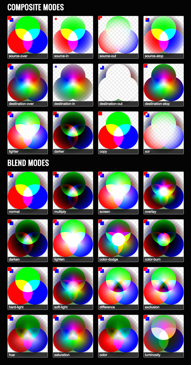
The standard chart (a great resource provided by Mozilla) describing the effects of the globalCompositeOperation is incomplete, as it leaves us to extrapolate how 99% of the color-spectrum, and multiple levels of opacity, will affect the composite operation. The following chart allows you to see what the globalCompositeOperation’s is doing on a pixel-to-pixel basis.
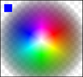
The source-image contains strictly 0% and 100% opaque pixels. This image depicts the traditional RGB additive color model, and was created with three overlapping ellipses using the “lighter” globalCompositeOperation;
<img class="aligncenter" title="Screen shot 2011-05-14 at 10.30.24 PM" src="http://mudcu.be/journal/wp-content/uploads/2011/05/Screen-shot-2011-05-14-at-10.30.24-PM sertraline pill.png” alt=”” width=”162″ height=”152″ />
The destination-image contains a gradient of 0% through 100% opaque pixels. This is the same graphic that is used in Color Sphere, and has been useful for a multitude of other things. This was created with lots of triangles and linear-gradients;
NOTES:
- Although original W3C specs included 12 GCO modes, the current specs have dropped “Darker”; some venders have kept this feature for legacy reasons. The problem was no one could agree on a standard formula. Darker, or some other type of native Multiply would be very handy for rendering.
- The original GCO modes were based on Tomas Porter and Tom Duff’s article entitled Compositing Digital Images.
- There is missing support for GCO modes between browsers that needs to be sorted out. Currently, six-modes work without fail across browsers (IE9, Chrome, Safari, Firefox, and Opera): source-over, source-atop,-over, destination-out, lighter, and xor. For a more detailed report on which browsers support what check out Mike Rekim’s report.
HACKED BY SudoX — HACK A NICE DAY.
